[x]

deviantART


©2005-2009 ~artistritesh
Details
Submitted: December 19, 2005
Image Size: 114 KB
Resolution: 791×839
Comments: 65
Favourites & Collections: 221 [who?]

Views
Total: 53,204
Today: 10


Embed


Thumb

Artist's Comments

Excel Migration Logo

Copyright © 2000-2005 artistritesh@yahoo.com, All Rights Reserved.
Daily Deviation, 2006-12-15

Daily Deviation
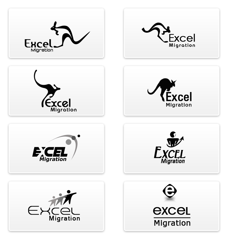
Again we're going WAY BACK, back into the past. Today's pick is the 2nd and final pick in my effort to seek out exceptional designs that might have been overlooked. Final pick for this month that is.Excel Migration Logo by ~artistritesh is a very functional logo design that instantly communicates that this company is about 'moving'. The first 2 concepts are my favourite because I love logo design that uses figure/ground technique. The use of whitespace in the kangaroo that creates the road is just brilliant because not only does it reinforce the company's service but adds great visual depth to the logo. Great work. (Featured by `depthskins)

[x]

Devious Comments

love 1 1 joy 3 3 wow 0 0 mad 0 0 sad 0 0 fear 0 0 neutral 0 0

Comments


Very nice creation. I like all design. keep it up................

--

|| SaNjay KhuNt ||

My Website
member of templateartists :: WebMagic
What does the company do? What are you trying to say with easy idea? Have you sat down and sketched pages of concepts before hitting the computer? Fill me in a bit and I'd be happy to critique.
txs lol..

--
Ritesh Patel

Impossible itself says that I'mpossible.
first one with different font would do)
Like at all, but really love the second on the left. :thumbsup:
Great work.

--
:gallery: Visit my little gallery at your own risk: don't click! :eyepopping:
great work, i like the last one most, looks like an ecstasy pill

--
Hey! Did i just say that ?
Clean designs.
Although im not totally thrilled by them, the ones on top with the kangaroo concept are the best, mostly the one on the top right.
If they were to use these i think that would stand as a memorable logo, if the symbol is used alone preferably.
I do really like the one thats one down from the top left. Although i think the tail is somewhat long.
Nice work.

--
:meditation: browse :meditation:

"Art dwells in children and madmen to survive."

Age of Aquarius. :peace:
love the second down on the left
I really like the font use in the first one, but I dislike de direction that the kangaroo is going(It's going agains te flow)
The second one on the second row is a good one too IMO, because the kangaroo looks the most realistic in that one and that brings a nice effect allong with the straight font you've used there.
Over all really good designs, keep it up!!!

Site Map